
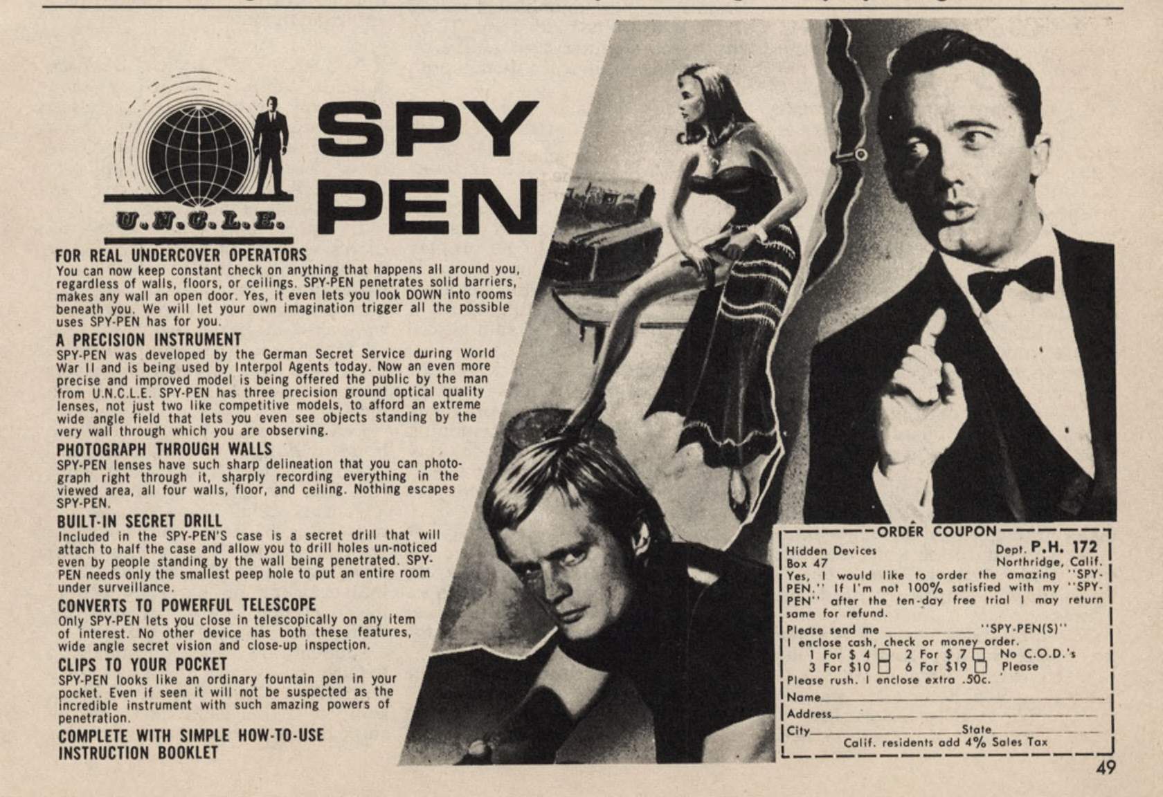
A $4 Man From U.N.C.L.E. spy pen sounds like a joke until you remember that $4 in 1967 is roughly $40 today. That was serious mail-order money for a novelty pen.
Let’s break it down.
The Page Is Divided Between Fact and Fantasy
The layout operates in two zones. The left side contains dense information: product descriptions, feature claims, bold mini-headlines, prices, and ordering details. The right side contains a cinematic montage of glamorous people, formal clothing, secretive gestures, and dramatic faces.
The left side explains what the pen does. The right side explains what owning it means.
That division is central to the advertisement’s strategy. The product requires technical justification, but technical information alone would not make a $4 pen feel valuable. The imagery supplies the emotional reason to buy. It turns a writing instrument into admission to a world of surveillance, danger, and professional intrigue.
The Eye Enters Through the Face…
Robert Vaughn (Napoleon Solo) is the dominant visual anchor. His face is large, dark, and sharply contrasted against the surrounding imagery. Readers tend to notice faces instinctively, and this face commands the first fixation.
His facial gesture communicates secrecy without requiring explanation. The pose immediately establishes the product’s central fantasy: hidden observation and confidential action.
His gaze then points toward the left side of the page. His eyes redirect attention toward the woman, the headline, the logo, and the sales copy.
The woman occupies the visual bridge between the headline and the large male portrait. She adds glamour and intrigue while keeping the upper half of the page connected.
David McCallum’s portrait fills the lower-center area, extending the montage downward and preventing the reader’s attention from disappearing after the first scan.
Borrowed Authority Makes the Product Believable
The advertisement borrows credibility from The Man From U.N.C.L.E. The insignia, globe, suited figure, and spy-film composition make the pen resemble official equipment rather than a novelty item.
The U.N.C.L.E. logo functions almost like a seal of approval. It suggests that the product belongs to the same universe as the television characters. The buyer is not merely purchasing a pen. He is acquiring an object associated with professional agents.
This is borrowed authority applied visually. The ad does not need to prove that the pen is sophisticated if the entire page makes it look like something issued by an intelligence organization.
Feature Subheads Create Product Abundance
The copy is organized around bold mini-headlines such as “A PRECISION INSTRUMENT,” “PHOTOGRAPH THROUGH WALLS,” and “BUILT-IN SECRET DRILL.” These subheads allow scanners to absorb the product’s supposed capabilities without reading every paragraph.
They also create feature accumulation. Each section adds another function, making the pen appear unusually versatile. The repeated headings turn a small object into a multi-purpose instrument.
The narrow left column supports this effect. It holds substantial information while remaining readable, and its ragged edge follows the diagonal boundary of the photographs. The page contains very little empty space. Nearly every area offers either information, imagery, or ordering instructions.
For a mail-order advertisement, that density communicates substance. Abundance makes the offer appear more complete and more worth the price.
…The Eye Ends at the Coupon
The likely eye path moves from the tuxedoed face to his gesture and gaze, then to the woman, the “SPY PEN” headline, and the U.N.C.L.E. logo. From there, the reader encounters the opening promise “FOR REAL UNDERCOVER OPERATORS” before scanning the bold feature sections.
The lower portrait pulls attention back into the montage. Finally, the boxed coupon in the lower-right corner becomes the action zone. Its dashed border makes it appear detachable and distinct from the editorial content.
The page moves from attention to fantasy, fantasy to explanation, and explanation to transaction.
The Pen Is Almost beside the Point
The physical pen is not the advertisement’s main visual attraction. The design sells what ownership supposedly enables: secrecy, power, access, and spy identity.
That is why the page works. Every major choice supports the same message. The imagery, typography, logo, diagonals, feature blocks, and coupon all reinforce a single promise:
For $4, the buyer could briefly enter the world of the professional secret agent.
The product was a pen, but what they were really selling was an identity.
20 Point Layout Review
- Two-zone composition: The page is split into a dense information block on the left and a cinematic fantasy montage on the right. The left explains the product; the right dramatizes the experience.
- Dominant visual anchor: Robert Vaughn’s face is the largest, darkest, and highest-contrast element. It likely receives the first fixation, especially because readers instinctively notice faces.
- Headline placement: “SPY PEN” occupies the upper-left quadrant in large, heavy type. It is easy to locate after the main image, although it competes with the U.N.C.L.E. logo immediately beside it.
- Borrowed visual authority: The U.N.C.L.E. insignia, globe, and suited figure make the product resemble official spy equipment. The logo functions almost like a seal of approval.
- Asymmetrical balance: The heavy portrait on the right is counterbalanced by the bold headline and dense copy on the left. The layout is visually busy but does not feel lopsided.
- Diagonal energy: Slanted photo boundaries divide the page instead of a rigid grid. These diagonals create movement and make the ad resemble a film poster or action montage.
- Fantasy before explanation: The glamorous woman, formal clothing, secretive pose, and handsome agent establish the desired identity before the reader encounters technical details.
- Multiple attention hooks: The design uses three faces, a large headline, a recognizable logo, and an order form. There is almost always another visually distinct object available to pull the eye onward.
- Directional gaze: Vaughn looks toward the left side of the page. His gaze helps redirect attention from the dominant portrait toward the woman, headline, and sales copy.
- Implied concealment: His gesture communicates secrecy without needing a caption. It also reinforces the central promise of hidden observation.
- Central female figure: The woman occupies the visual bridge between the headline and the large male portrait. Her placement keeps the upper half connected and adds glamour, intrigue, and voyeuristic implication.
- Lower supporting portrait: David McCallum’s face fills what would otherwise be an empty lower-center area. It extends the montage downward and prevents the eye from leaving the page after viewing the upper images.
- Copy hierarchy: The body copy is broken into bold mini-headlines such as “A PRECISION INSTRUMENT,” “PHOTOGRAPH THROUGH WALLS,” and “BUILT-IN SECRET DRILL.” Dual readership path: These let scanners absorb the product’s capabilities without reading every line.
- Feature accumulation: The repeated bold subheads create the impression of numerous capabilities. Visually, the sheer quantity of sections makes the product appear unusually versatile.
- Narrow copy measure: The left column is wide enough to hold substantial information but narrow enough to remain readable.
- Minimal white space: Nearly every area contains copy, imagery, or ordering information. This suits the mail-order style, where abundance and specificity can make the offer appear substantial.
- Coupon isolation: The order form is boxed with a dashed border in the lower-right corner. It looks detachable and behaves as a separate action zone.
- Natural closing position: Because Western readers generally progress downward and rightward, the coupon occupies a logical endpoint. The page moves from attention to fantasy, then explanation, then transaction.
- Weak product visualization: The pen itself is not the main visual attraction. The design sells what owning it supposedly enables: secrecy, power, access, and spy identity, more than its physical appearance.
- Visual-message fit: Every major design choice supports the same theme: confidential information, surveillance, glamorous danger, and affiliation with professional agents.
RW
.
.
.